TwiGVis is software I created to visualize the timing and geographic distribution of geotagged tweets. It was originally designed for two datasets we* collected related to Hurricanes Irene & Sandy. TwiGVis is written in Processing, a programming language designed for graphical applications.
TwiGVis has been extended to also visualize some data we've received from our partners at the American Red Cross. These new data sets give us information on the mobile SMS donations("Text REDCROSS to 90999 to give $10 to American Red Cross Disaster Relief…") during and after Sandy and Irene.
TwiGVis is very much a work-in-progress. I started developing this when all we needed was something to whip together a graphic for a slide deck, and it's grown and mutated over the last several months, and continues to do so as. Feel free to use and modify TwiGVis as you wish, but know that I'm making no promises about how well it works :)
I'm making the code available here under the GPL license. Use, modify, edit, whatever you want. All I ask is that you drop some credit my way if you do.
Input Data
TwiGVis uses six text files as input. Four of these are specific to the particular data you're trying to visualize, and the other two give the locations of coastlines (noaa_coasts.dat) and international borders (intl_borders.dat).* If you don't want to display either of these, just set showCoastline or showIntlBorders to false.
For the other four files TwiGVis uses I've included samples for both Irene and Sandy. I've subsampled roughly half the twitter and donation data we have for each storm and added some random noise to the timing, mostly to further anonymize the donation transactions from the Red Cross.
tweetFile — {irene,sandy}_tweets.csv
This is the only one which is strictly necessary, all the others can be deactivated if you through the right switches in the code (set showDonations=false, etc.). There are three fields: a timestamp (milliseconds in the Unix epoch), a latitude, and a longitude. One line per tweet in the data set.
eyeFile — {irene,sandy}_eye.csv
One clever Twitterer spoofed the location of his account to match the location of the storms' eyes. We wanted to highlight those tweets, so we pulled them out and put them in this special file. The first three fields are the same as the tweetFile: timestamp, latitude, longitude. After that I also have Twitter user id and a traditional date/time. These fields aren't necessary, and if they're missing TwiGVis should still work fine. If you're not specifically visualizing hurricane data there would be no need for either this or the trackFile.
trackFile — {irene,sandy}_track.csv
This stores the official track that the eye of the storm took, according to NOAA. The first two fields are the only ones used; they give the latitude and longitude. After that comes the date and time in the form MM/DD/HH.* After that is wind speed, atmospheric pressure, and storm category. None of those are used at this point, but they might come in handy.
donationFile — {irene,sandy}_donations.csv
This is derived from the data we got on the Red Cross' text-to-donate program. The first two fields give the NPA (area code) & NXX (prefix exchange) for the phone number which made the donation. I've replaced these all with 123 and 555 for the sample data. The next field gives the donation amount. This is followed by the timestamp (again in the Unix epoch). The latitude and longitude of the phone's exchange are given in the final two fields. These we calculated offline using a proprietary database. If you want to map phone numbers then feel free to contact me to discuss methods, but the license we purchased doesn't allow me to make the tool to translate phone numbers to latitude/longitude public.
TwiGVis can output a final still image of the entire data set …
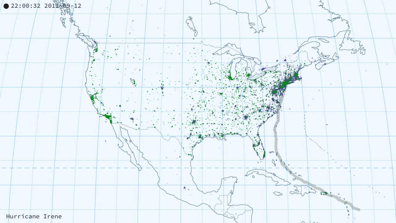
Hurricane Irene: tweets and donations in the US.
Hurricane Irene: global tweets.
… or multiple frames suitable for rendering into an animation.
In order to do the latter, simply set saveFrames=true. In either case, files will be output with a prefix you can specify in the outputName variable. Individual frames will be called "outputName/frame-####.jpg" and the still image of the entire dataset will be called "outputName.tiff".
Mode
TwiGVis has two different ways of rendering the datasets. The first is "cumulative" mode. If you select this (cumulativeMode=true) then all the tweets in your dataset which have been sent thus far will be rendered onto the map. The second is "instantaneous" mode. In this mode only recent tweets appear on the map at any one time.
It's perhaps easiest to see this if you try it out yourself, but here's my shot at explaining things. TwiGVis has an internal clock (t). Each frame of the animation that clock is advanced by stepSize seconds. In cumulative mode, everything in the dataset that happened before t will show up on screen. In instantaneous mode, only things which happened between t and t-windowSize will be visible.
Hitting space while TwiGVis is running will toggle between modes.
Map Projections
I implemented a handful of different map projections in rough order of how far from the basic (lon,lat)->(x,y) equirectangular projection they were. As a result there are a couple — Lambert, Gall — that aren't recommended for use but are still available. I'd recommend you stick to either the Winkel Tripel or the Kavrayskiy. They were designed from the ground-up to look appealing, and they do.* Plus they're suitable for use at all scales, and I've tested them the most thoroughly.
Another consideration is that TwiGVis was always designed with the intention of outputting video. That meant the output was going to be rendered in a 16:9 aspect ratio. Different projections have different aspect ratios of their own. At various times I tried to balance these criteria against each other, but right now TwiGVis gives higher priority to the 16:9 of the output.
That's one more reason to prefer the Kavrayskiy, by the way. It's intended aspect ratio is
sqrt(3) ≈ 1.73, which is very close to the video's aspect ratio of 16/9 ≈ 1.78. As a result the output you see with Kavrayskiy in TwiGVis is very close to what it's supposed to be. Winkel is not bad in this respect; it's propper aspect ratio is ∼1.63.
Mercator
Just … don't. I ought to remove this as an option, but I'm loath to delete working code once it's written. I guess it could be useful to someone, somehow. Suum cuique, right?
You can see what these look like in the Gallery below.
When I first created TwiGVis I set it up to allow three different views: the entire world, the northwest quadrant of the world, or the continental US. Lately I've been adding the ability to pan and zoom the map view to an arbitrary position and scope. That is very much still a work-in-progress. The Winkel and Kavrayskiy are the only two that I have (or likely will) implemented this new pan-and-zoom functionality with.
Change zoom level (presets) q : entire globe w : northwest quadrant (North Pole down to Equator, and Int'l Date Line east to Prime Meridian) e : lower 48 states
Speed:
(change how much real-world time elapses each frame of the animation) - : slower + : faster
Pan map view j : left k : right i : up m : down
Zoom map view < : zoom in > : zoom out
other space : toggle between instant mode and cumulative mode
Gallery
These show the cumulative set of tweets (purple) and mobile donations (green) from Sandy and Irene. They're given in the two recommended map projections (Winkel Tripel and Kavrayskiy VII), and at the three preset scales (global, northwest quadrant, and continental US).
Sandy — Winkel Tripel
Sandy — Kavrayskiy
Irene — Winkel Tripel
Irene — Kavrayskiy
Here's what the video output looks like. This is scaled down; you can get the full 720p HD version here or through Vimeo. Here each day in realtime takes 10 seconds of video.
I like that you can see very clear waves of donations coming in across the country at certain times (e.g. around the 40 second mark).
This also helped us find an anomalous large number of donations coming in from Puerto Rico. We have at least two hypotheses for this, both untested as of yet. Either people in PR donated more because the stormed had already tracked over the island, so they felt involved, or because it hit a largely Puerto Rican section of New York heavily, and people relatives back home donated.
This is what the corresponding cumulative map looks like at the end.
For reference, here are some maps of the Sandy tweets only in the other three projections. They are much more lightly vetted, and generally not recommended for use out of the box.
Continental US
Albers Conic
Gall Stereographic
Lambert Cylindrical
Global
Albers Conic
Gall Stereographic
Lambert Cylindrical
Code
You can view all of the code on this page, or download the individual files from the links below. The entire codebase as well as examples and sample input files can be downloaded here. If you don't have Processing, you can download it free here.
tweetGeo.pde
[download]
This is the main file, including declaring preferences, global vars, etc., and Processing's setup() and draw() functions.
rendering.pde
[download]
Extra functions for drawing the coast lines, borders, graticule, etc.
"What's that? You think I don't like the Peters map because I'm uncomfortable with having my cultural assumptions challenged? Are you sure you're not … [puts on sunglasses] … projecting?"


 Albers Conic
 Gall Stereographic
 Lambert Cylindrical
 Albers Conic
 Gall Stereographic
 Lambert Cylindrical